For this project, as a Creative Project Manager I managed the relationship with the client (Microsoft), coordinated the creative team, and ensured smooth communication across all parties. I was responsible for briefing the creatives, assisting the director throughout the production, and preparing all presentations and deliverables. I oversaw the project timeline, managed feedback rounds, and made sure everything was delivered on time and aligned with both the creative vision and the client's expectations.
Microsoft App Store - System Refresh
The App Store is where users first encounter applications, making the images displayed there crucial in shaping initial impressions that lead to downloads. Recognising this, we were tasked with refreshing and unifying the visual presentation of Microsoft 365 products on the store.
With this objective in mind, we carefully considered the narrative behind these images and how the visual system would bring them to life, ensuring both cohesion and vibrancy. Our system of images is designed to connect with each product’s identity, whether through the synthesis of its icon or the key visuals in their respective user interfaces. This ensures that when users first encounter the app in the store, the visual representation serves as an accurate synthesis of the product’s capabilities while also reinforcing the overarching M365 brand.
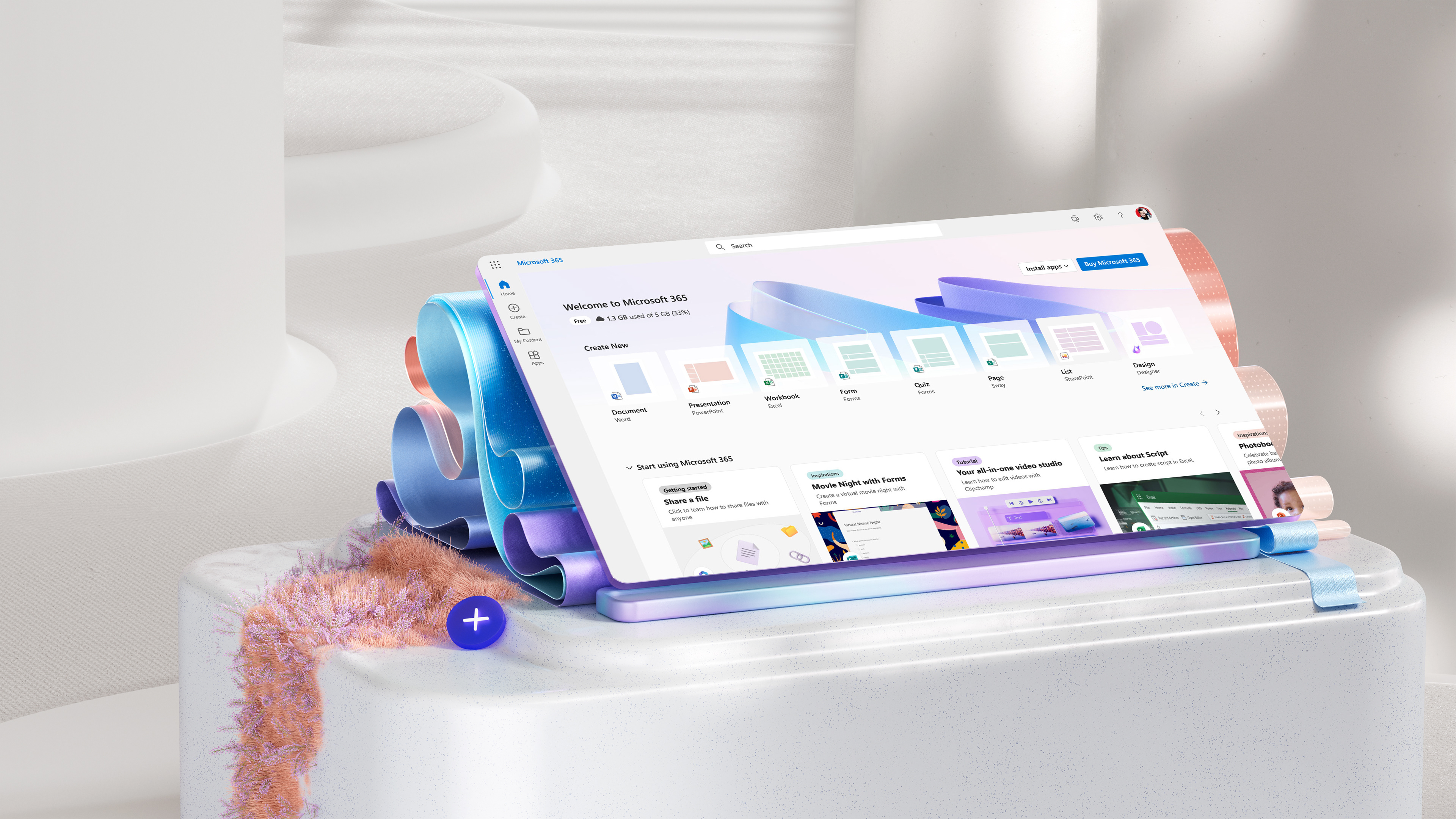
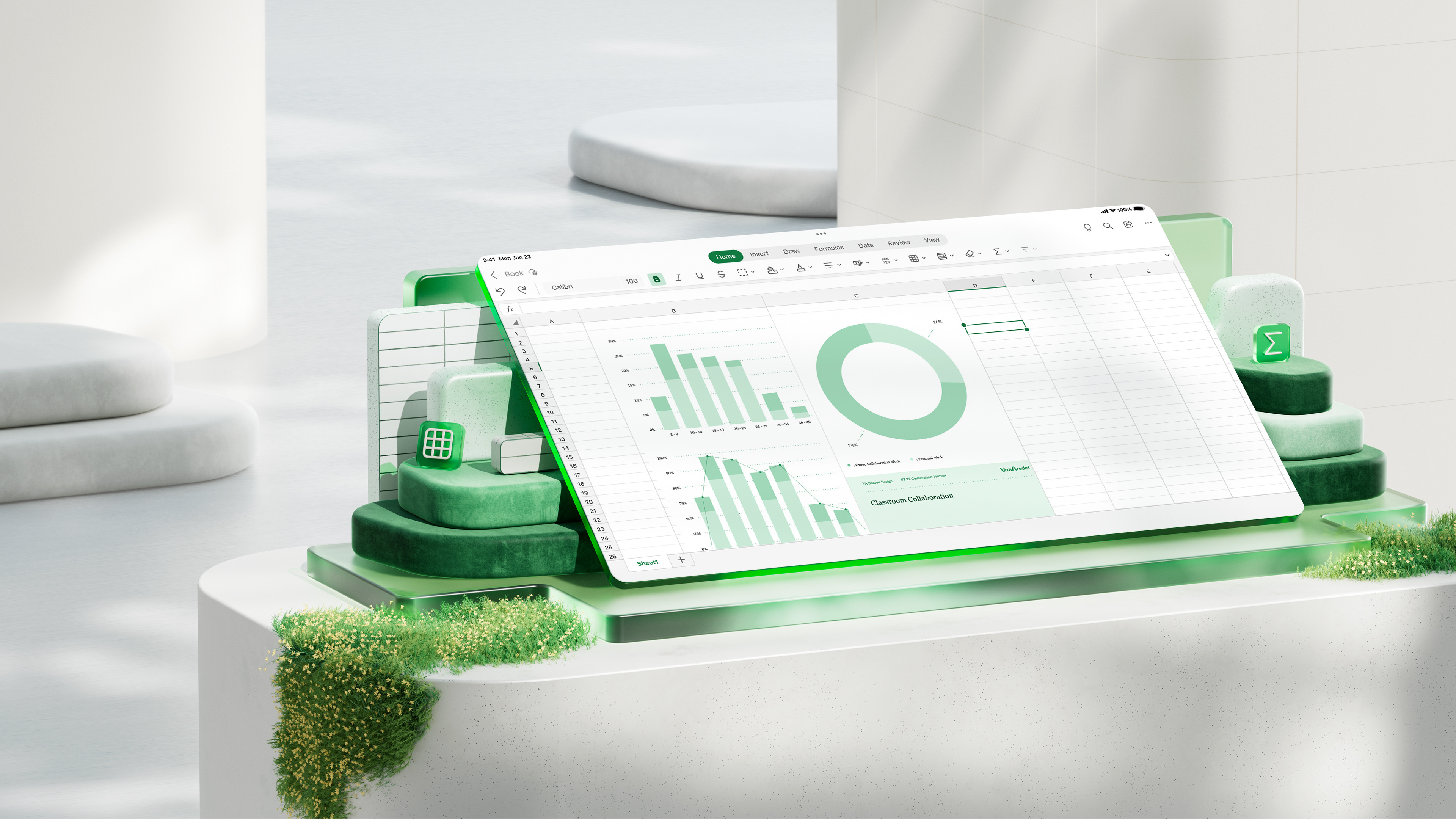

Our approach focused on preserving the core value of each product by capturing the essence of their unique experiences. Our goal was to create compelling images for each application—images that are not only visually appealing and energetic but also faithfully represent the product’s essence and align with the brand's attributes. Each product retains its distinct identity while being integrated into a cohesive, broader visual universe.
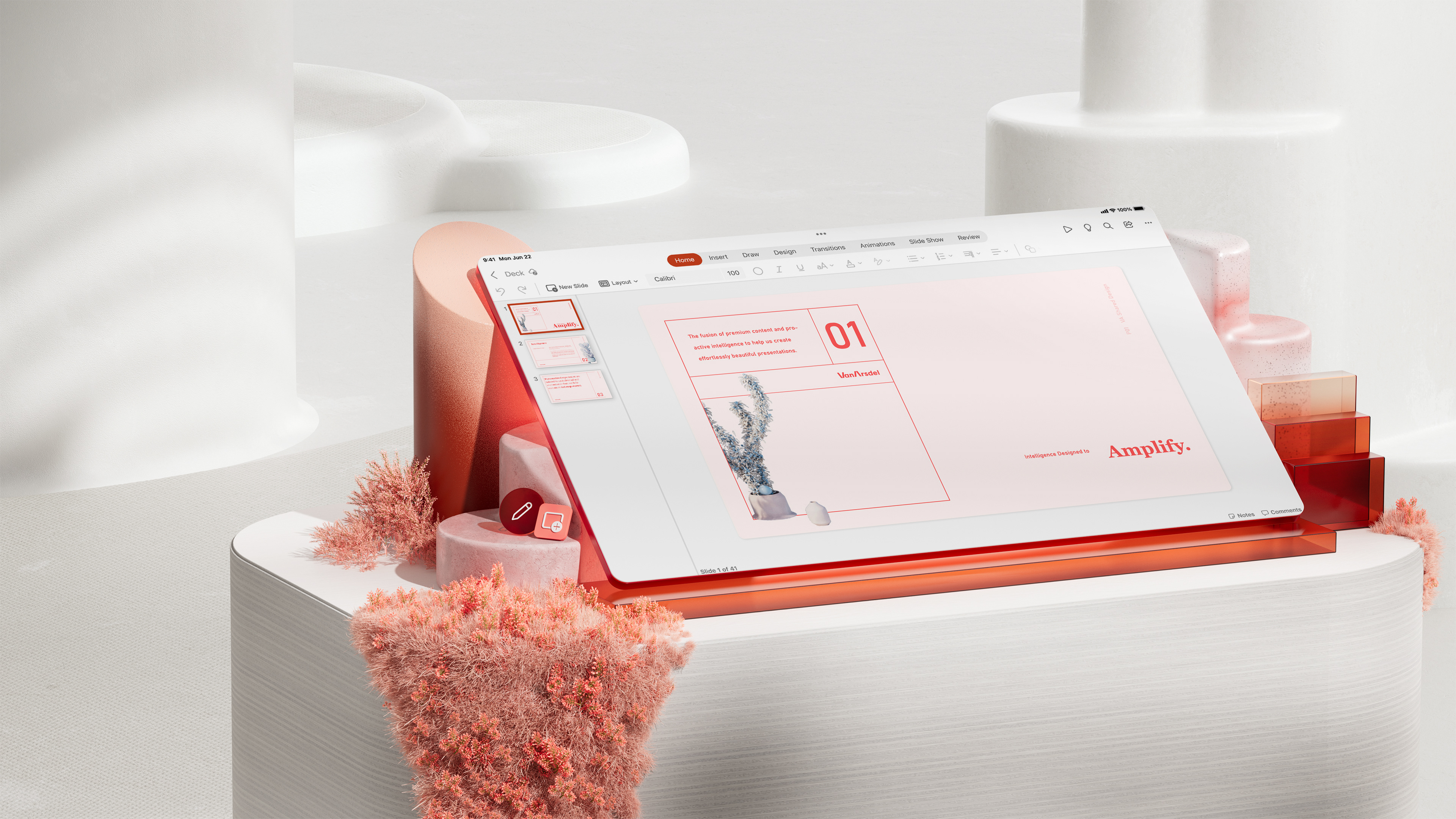

We began by exploring the narrative behind these images and envisioning how the visual system would take shape. This process led us to the concept of totems that elevate each application, both literally and figuratively. The central idea was to present the UI screens within a clean, uncluttered environment that would highlight the product and make it the focal point.
To achieve this, the elements within the scenes are carefully grouped and arranged, while still allowing flexibility for creative layout play in the background and secondary elements. Our objective was to define a space that could showcase the user interface in a fresh, minimalist, yet captivating style.
To achieve this, the elements within the scenes are carefully grouped and arranged, while still allowing flexibility for creative layout play in the background and secondary elements. Our objective was to define a space that could showcase the user interface in a fresh, minimalist, yet captivating style.

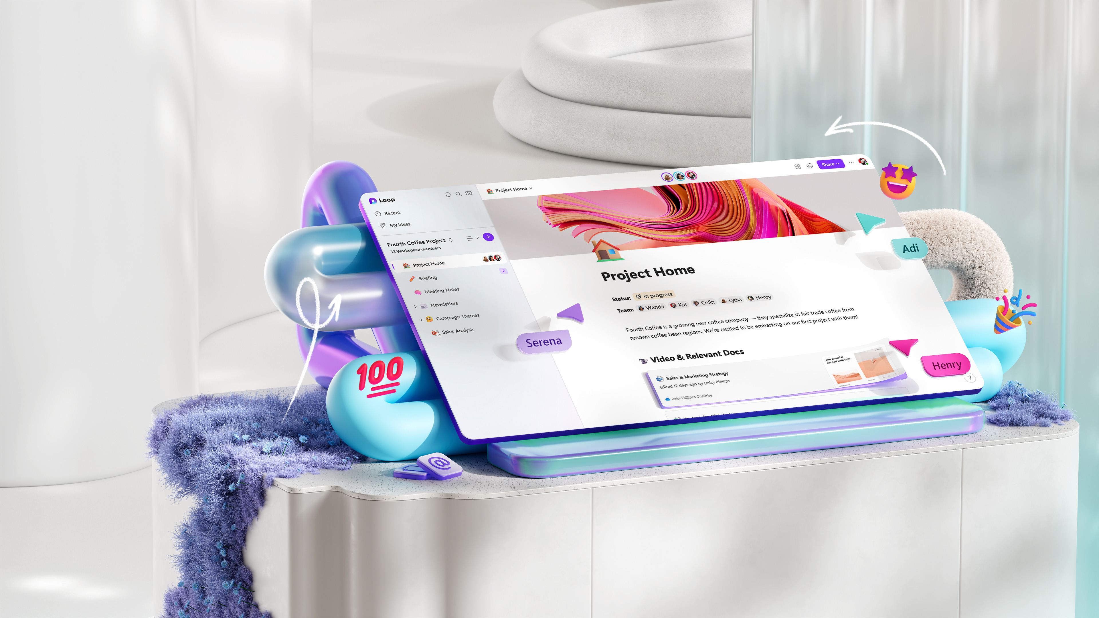
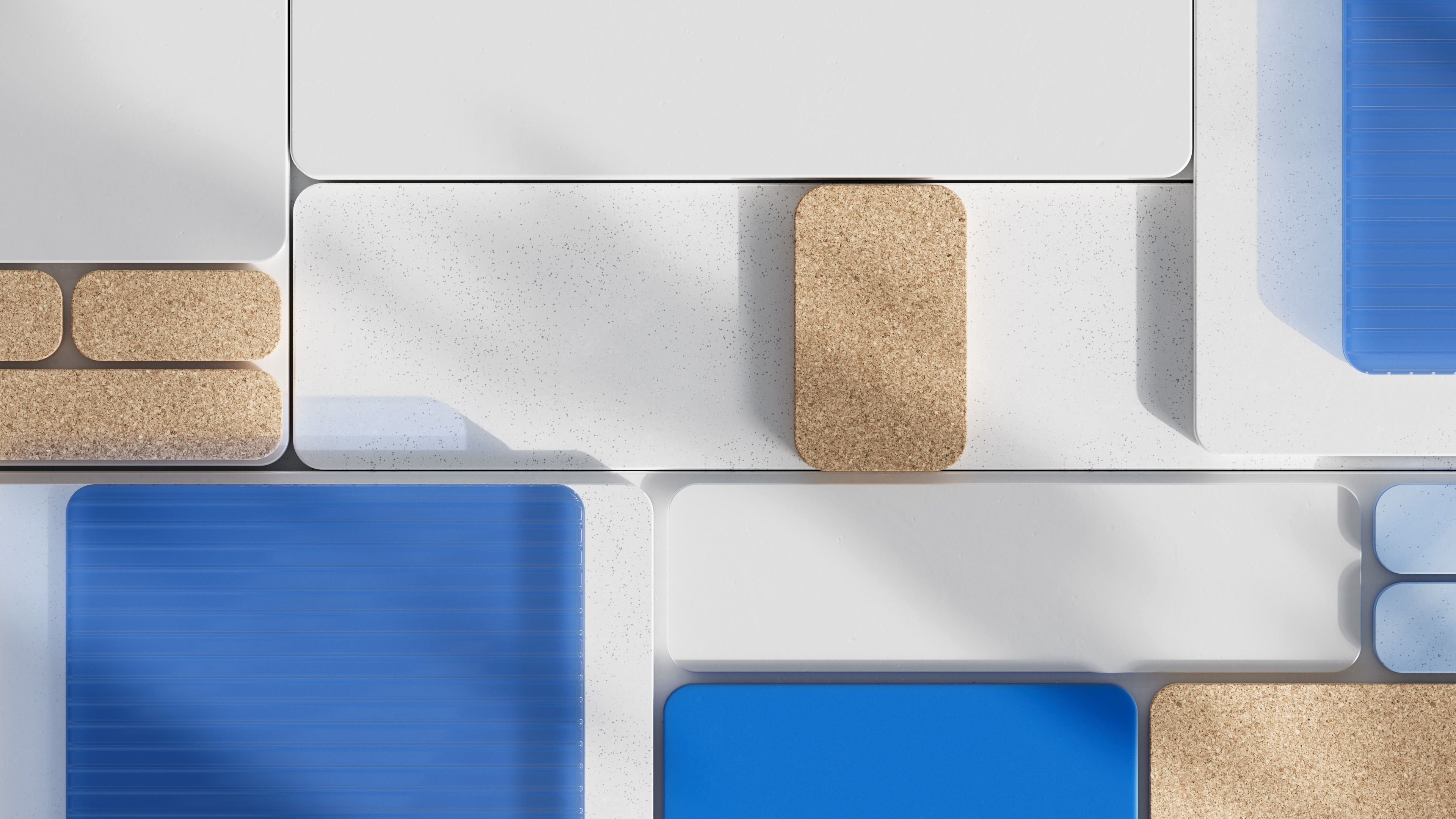
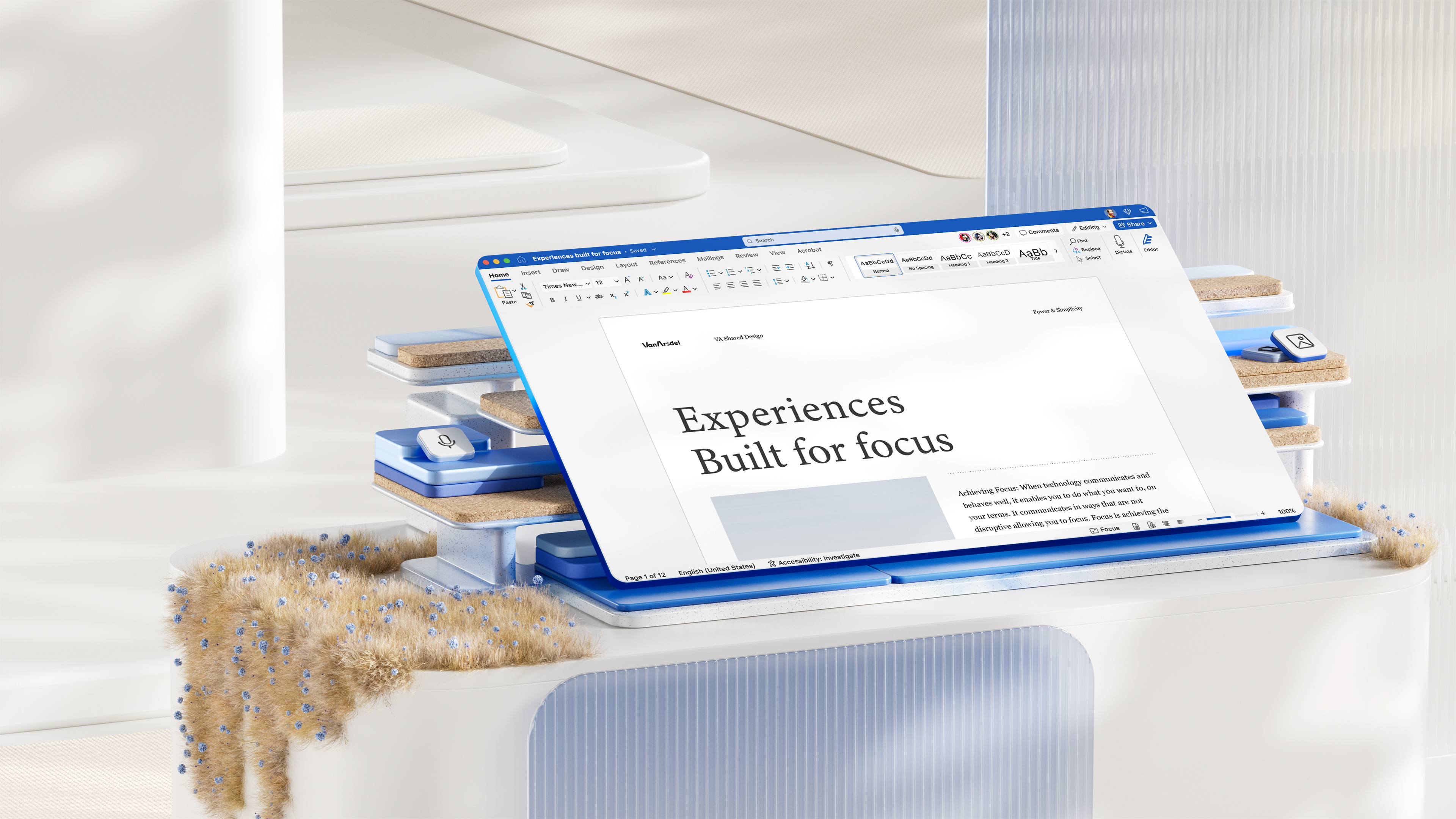
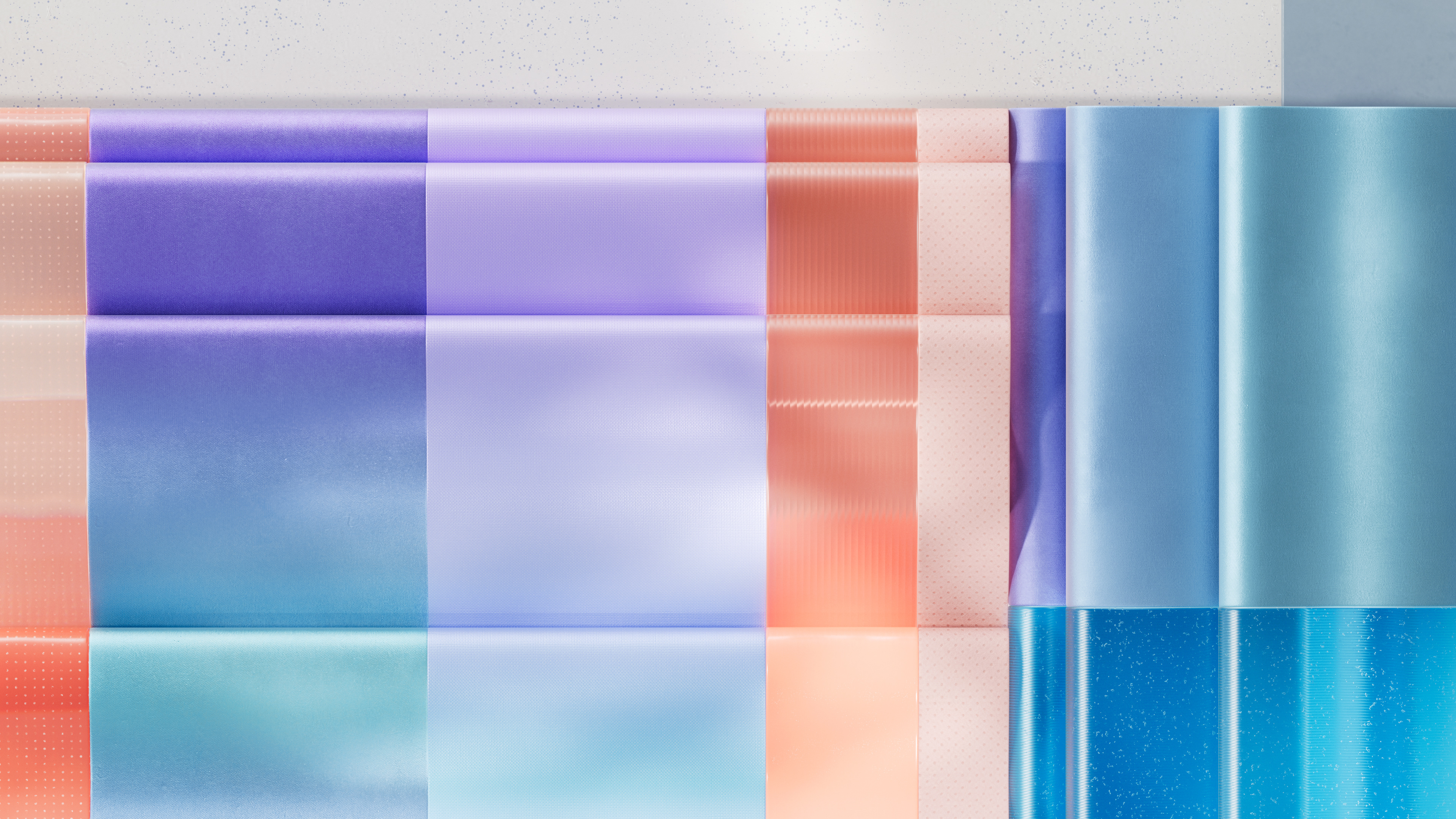
To create an effective system, we established consistent camera positioning, guidelines for all images, and uniform lighting to maintain homogeneity across the visuals. We also standardized common materials for all applications while selecting unique materials for each one. This approach allowed us to create a solid and captivating system with sensory-rich materiality that inspires positivity and encourages different ways of engaging with the images. By doing so, we facilitated the discovery of metaphors and connections that each image has with its respective app.
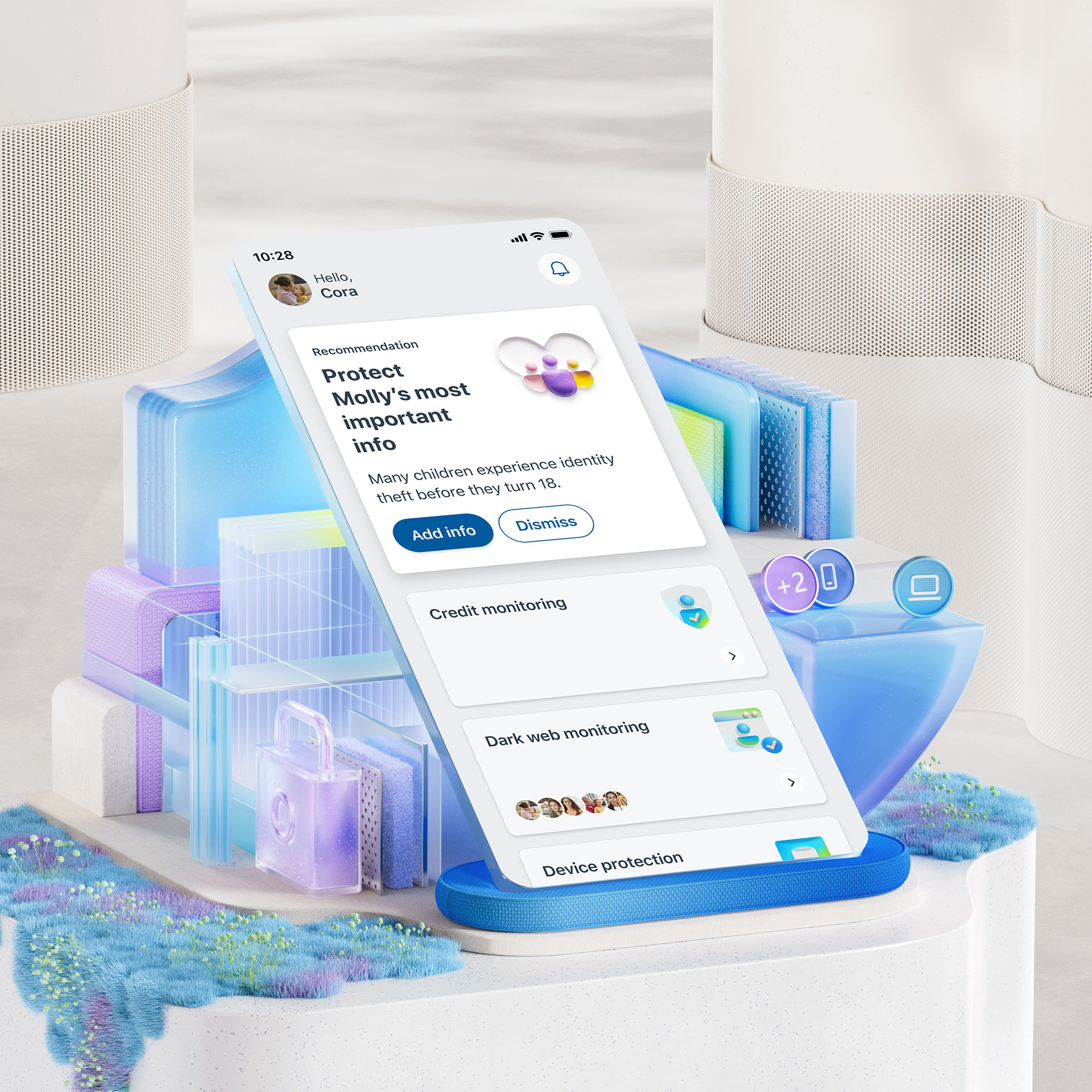
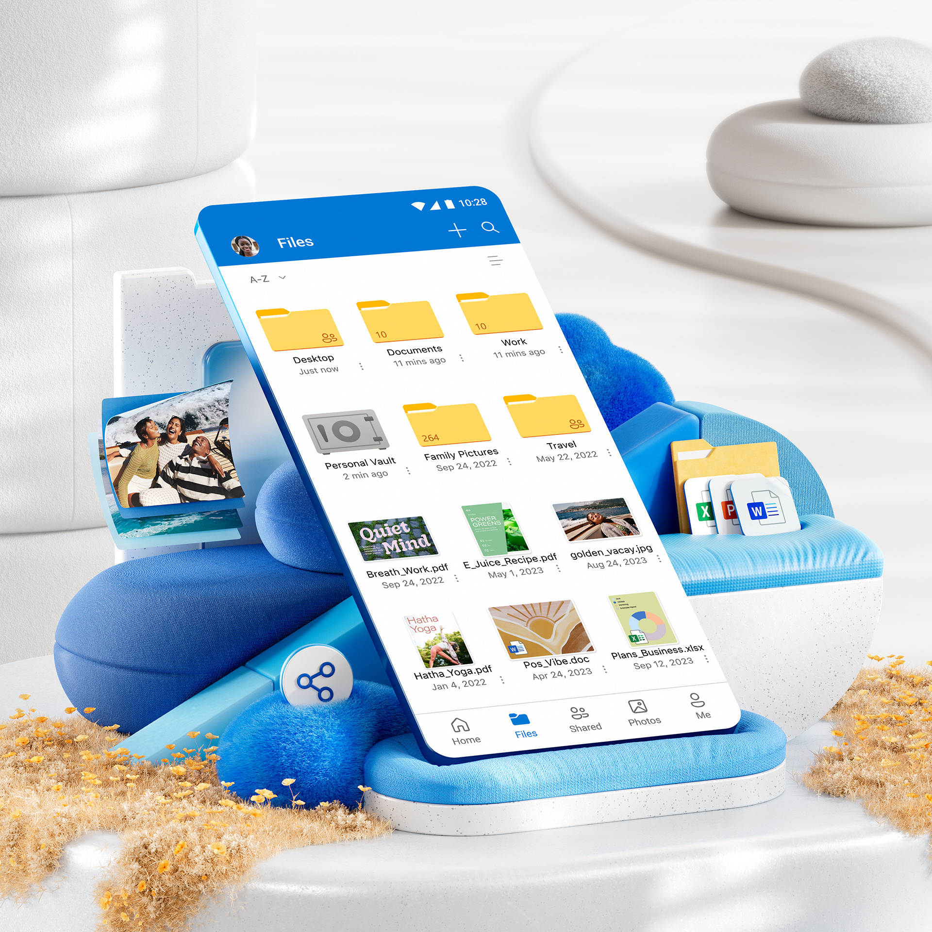
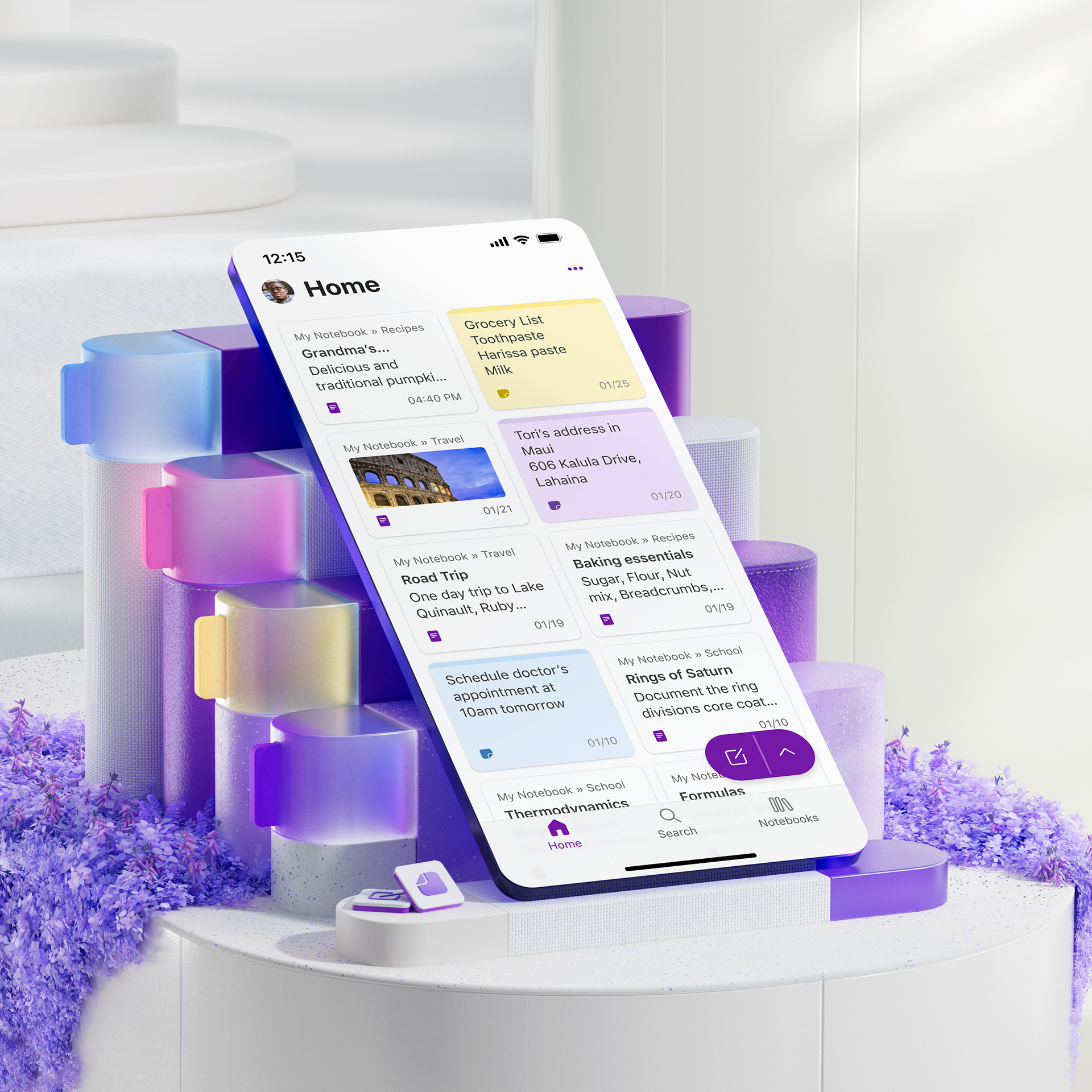
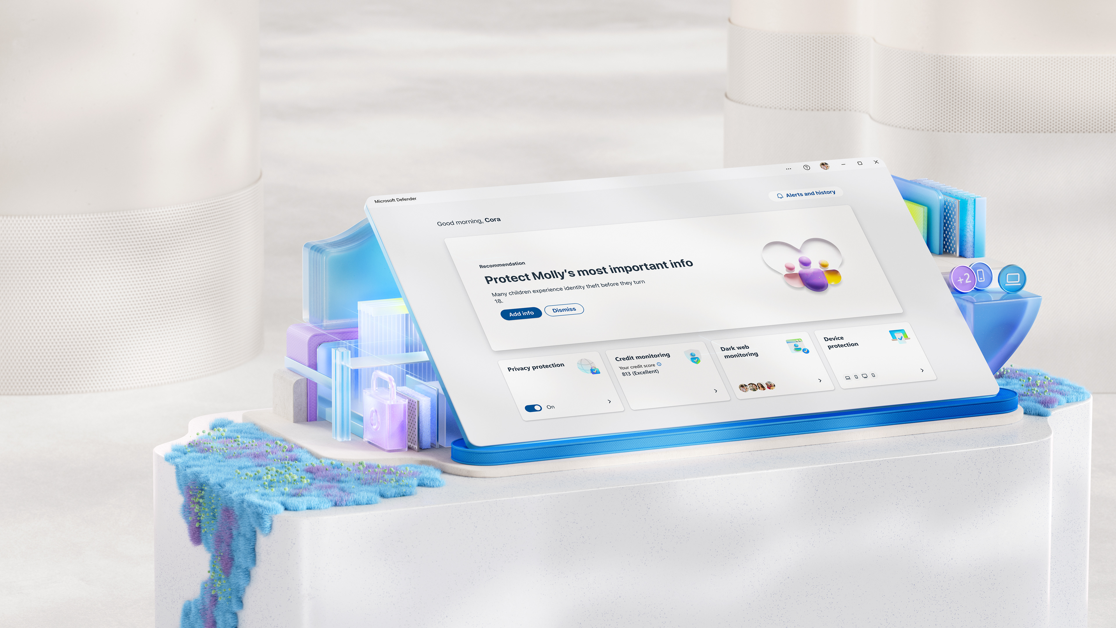
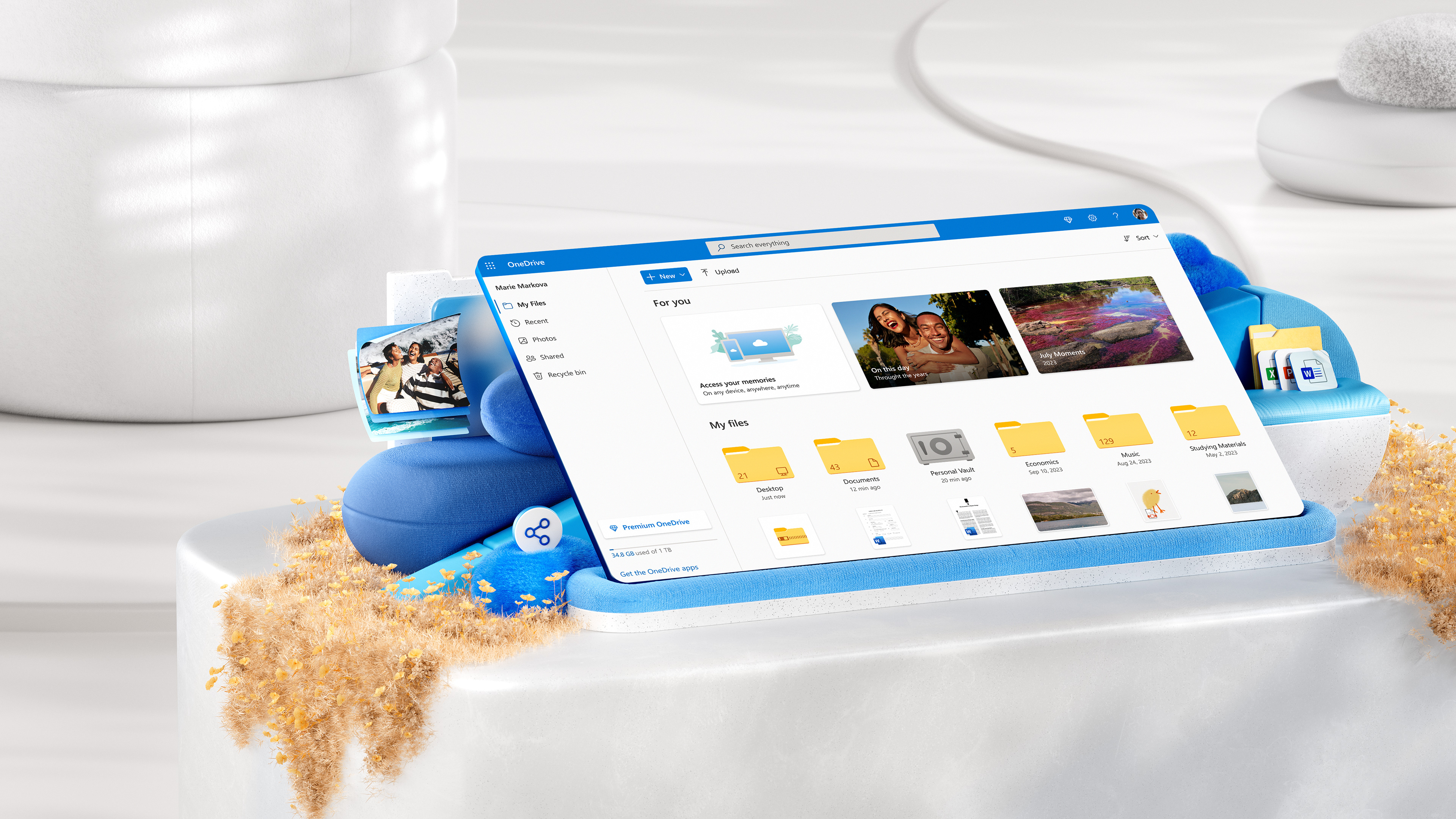
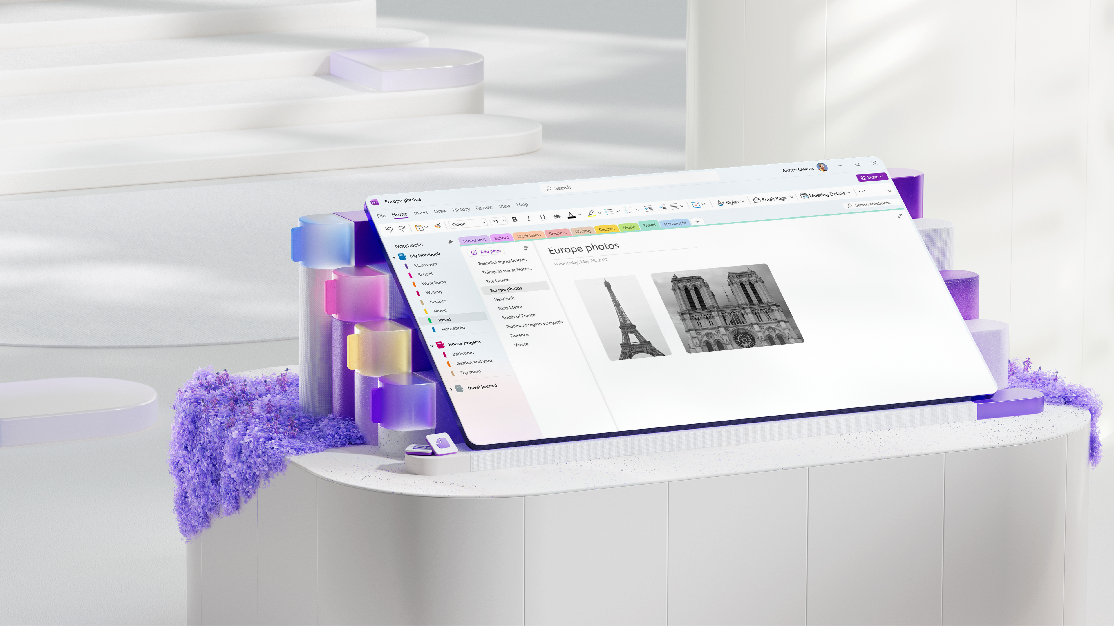
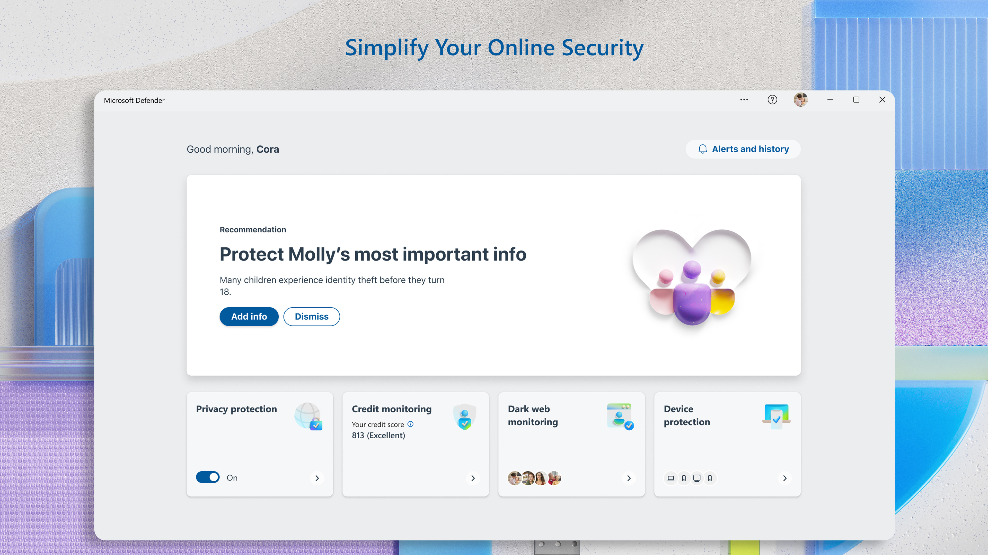
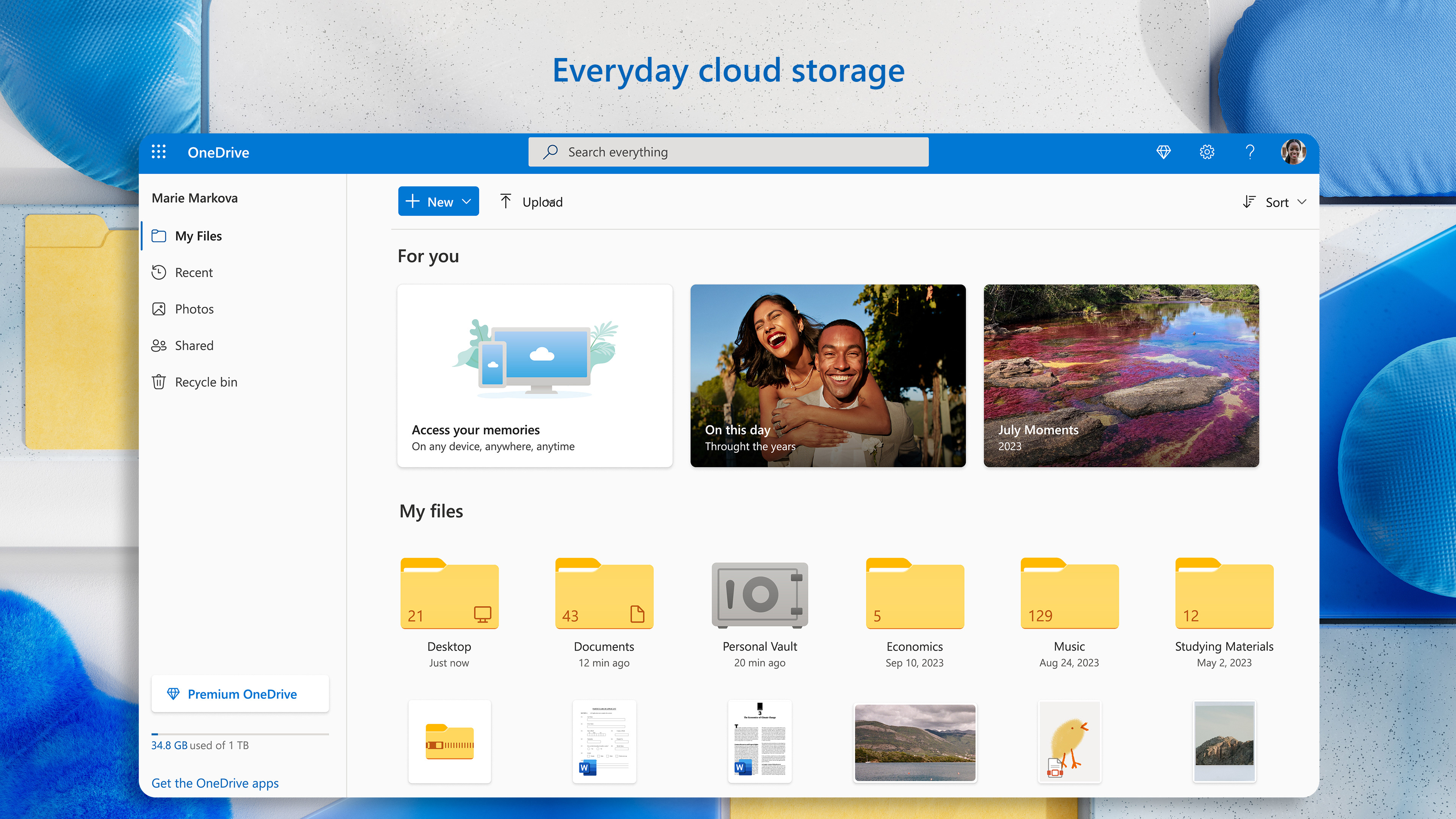
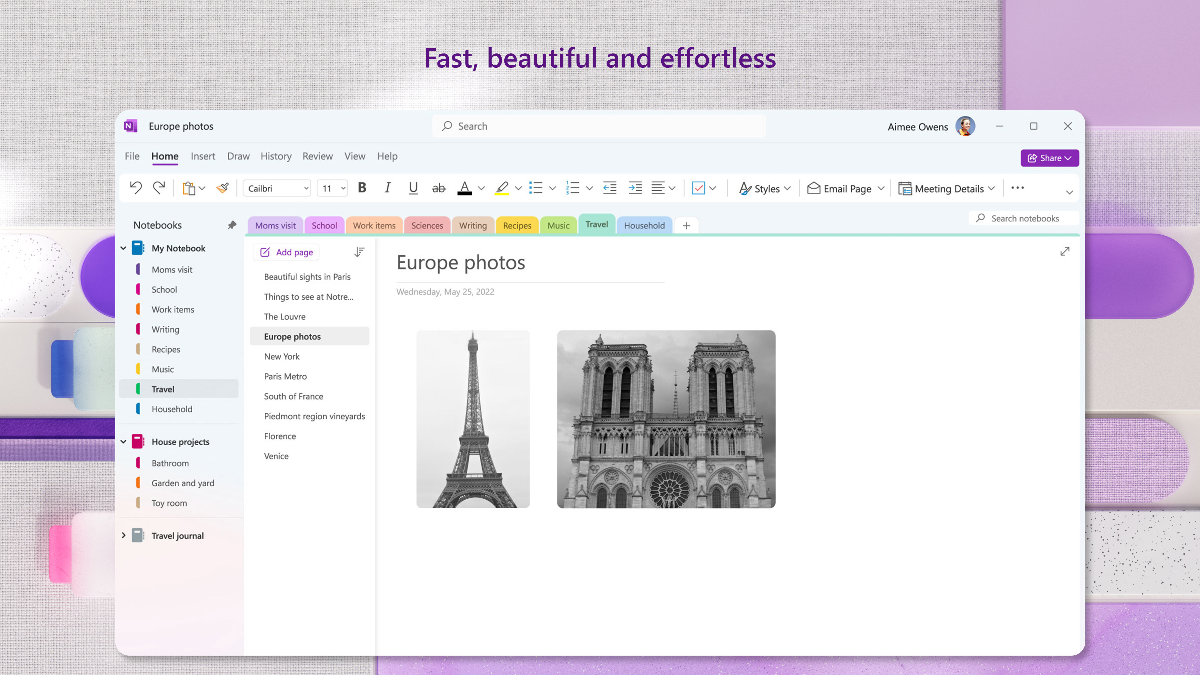
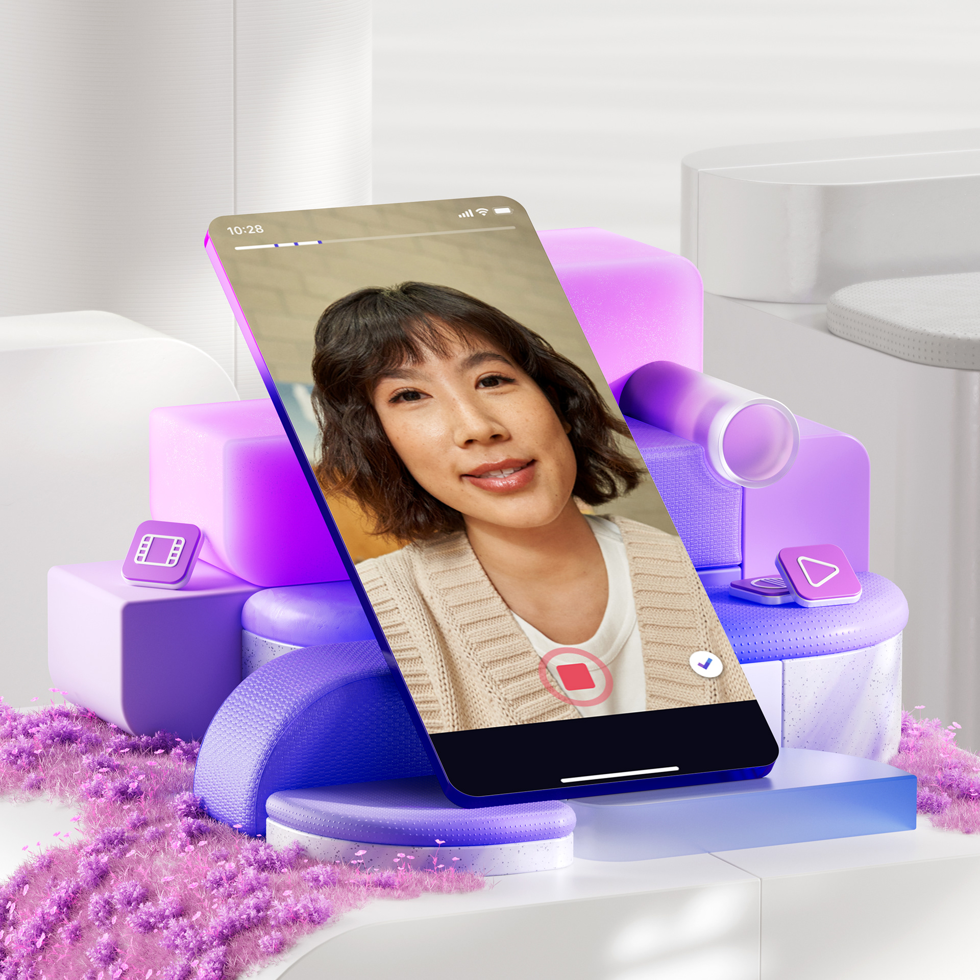
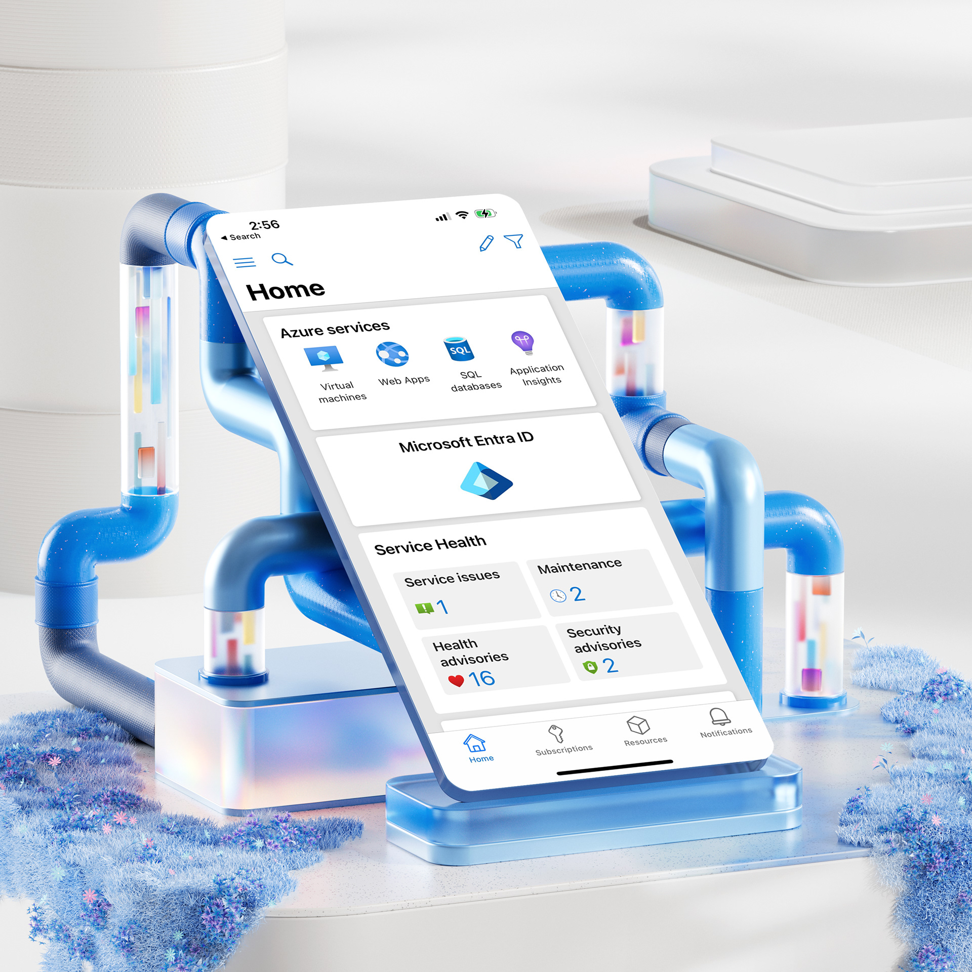
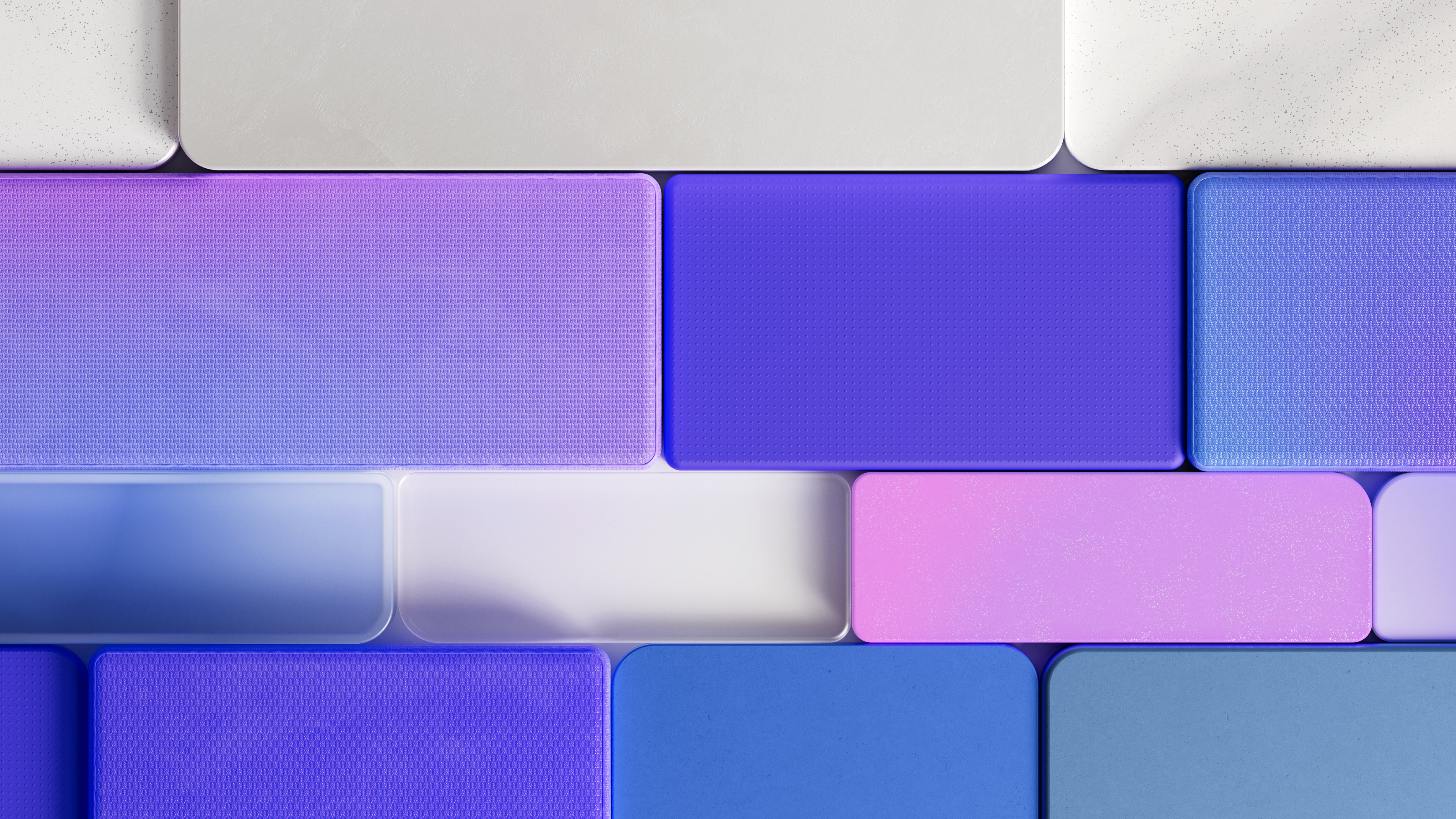
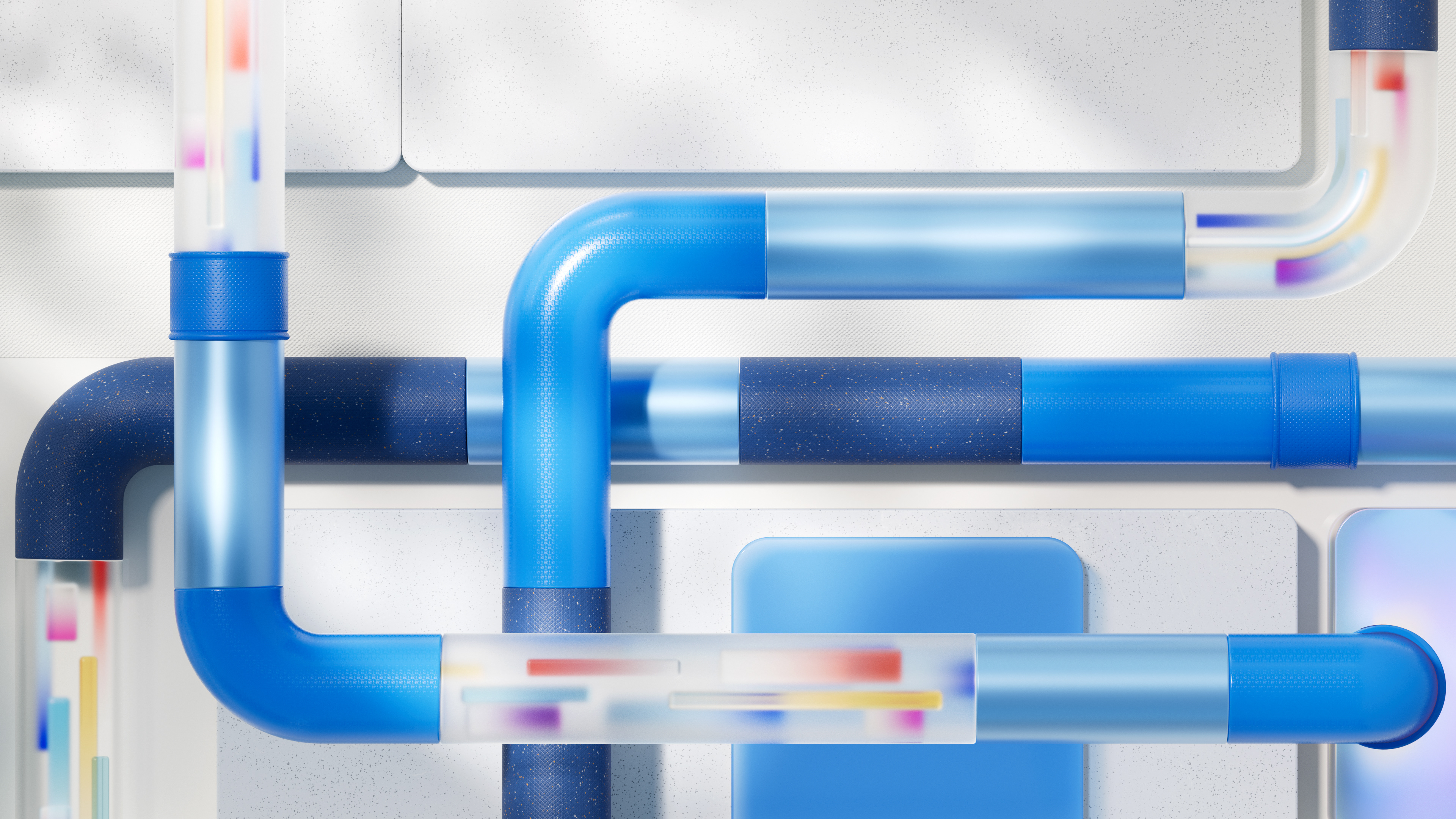

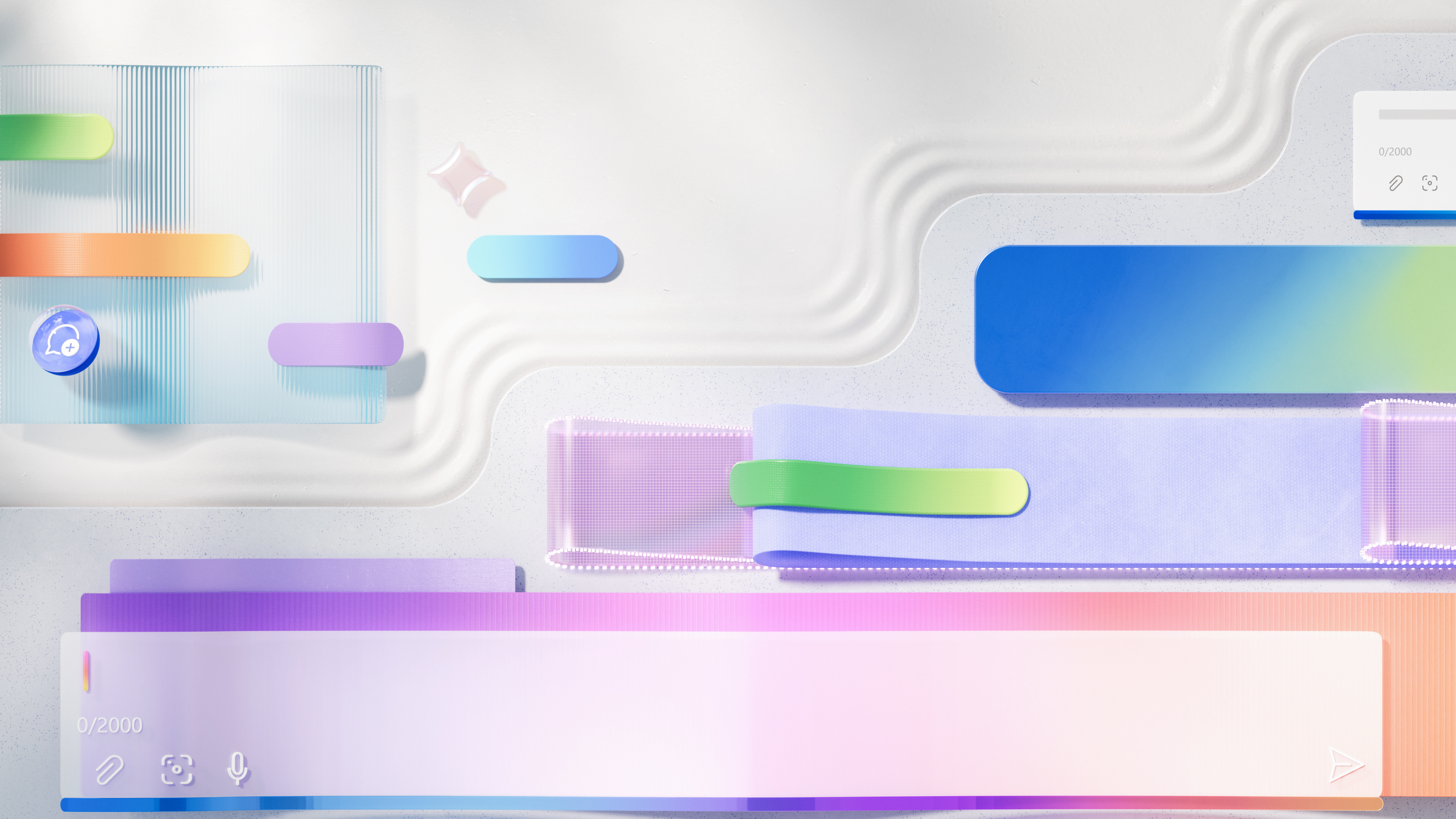
Cover images for Ui mockups
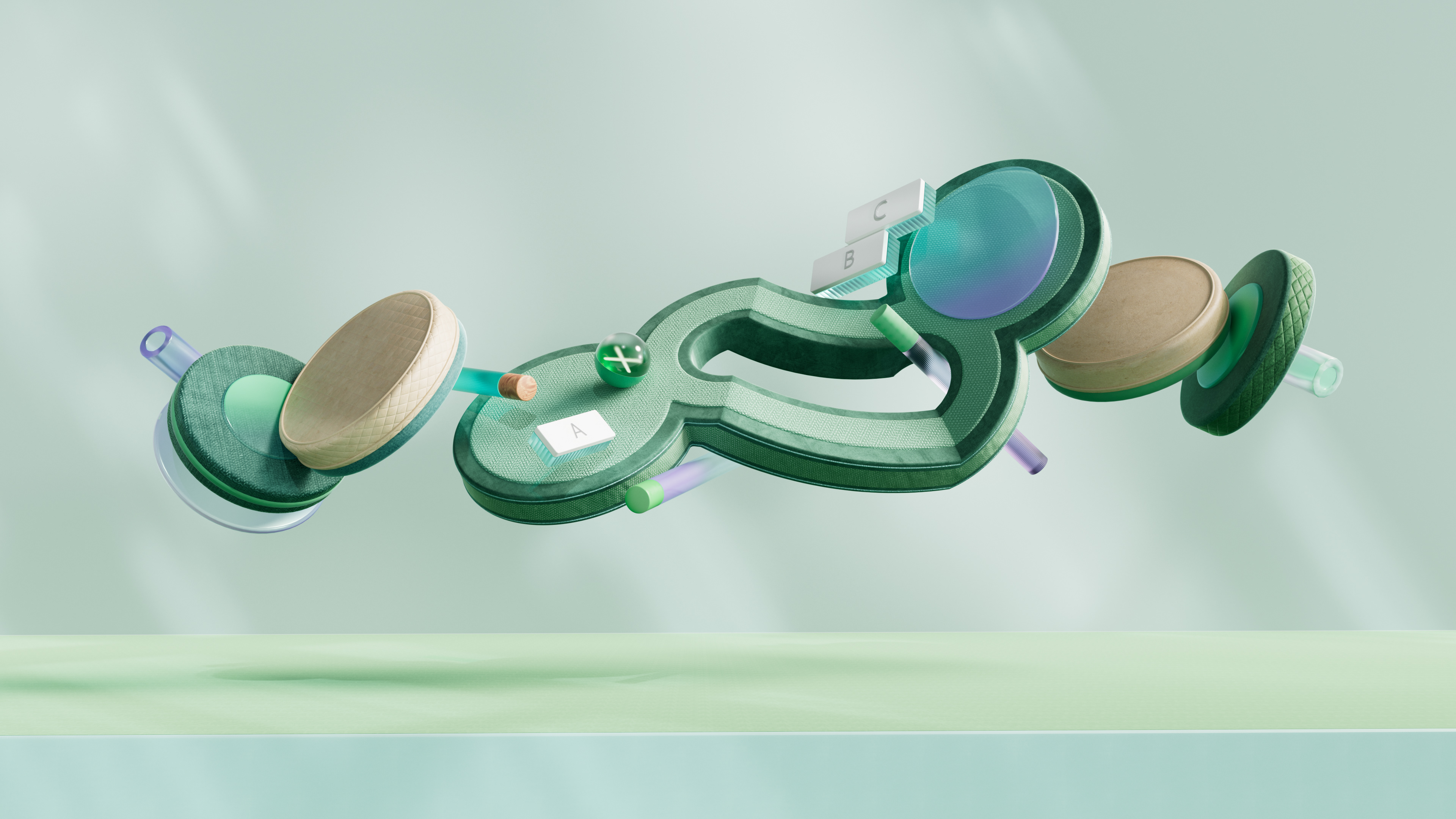
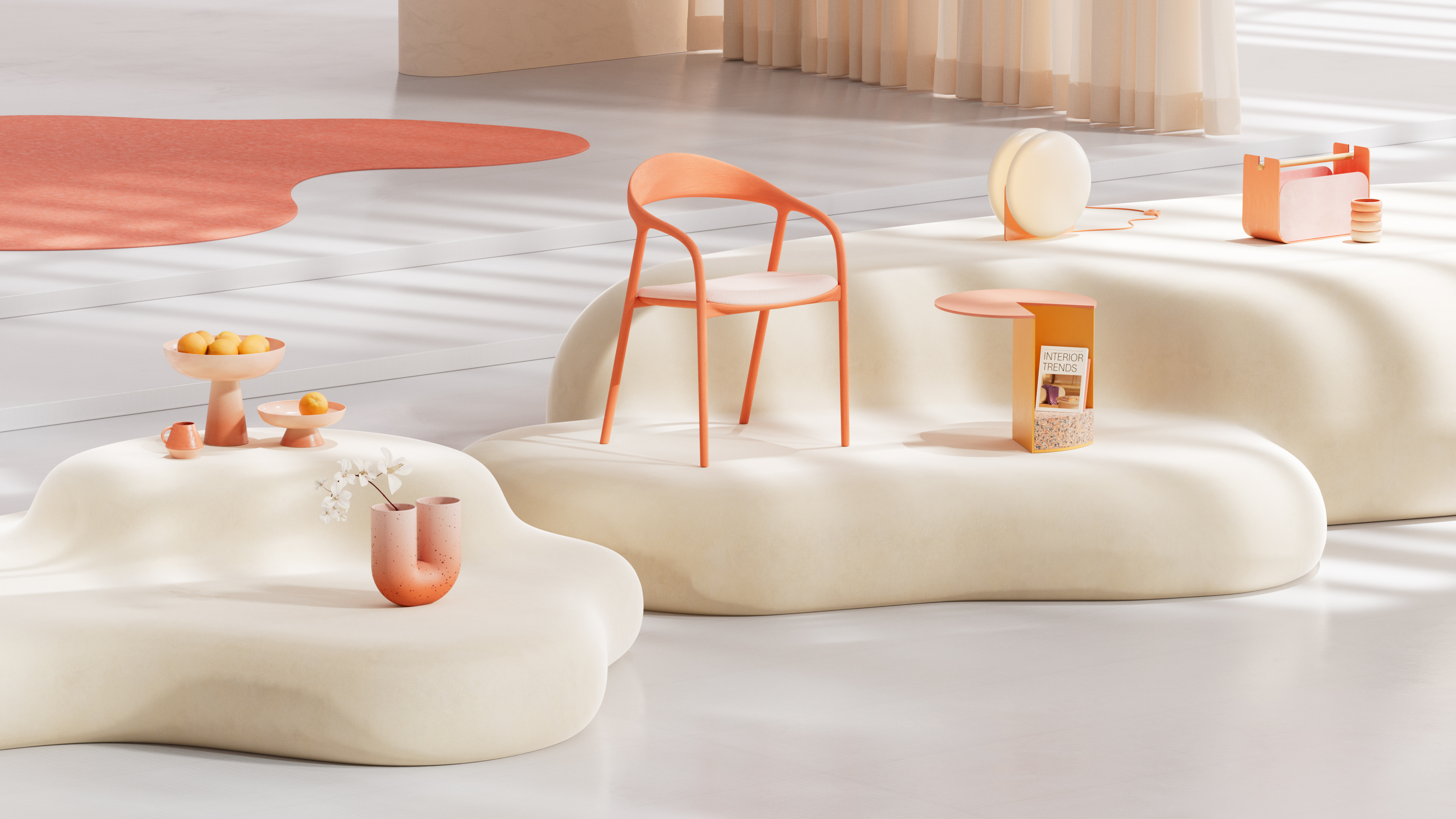
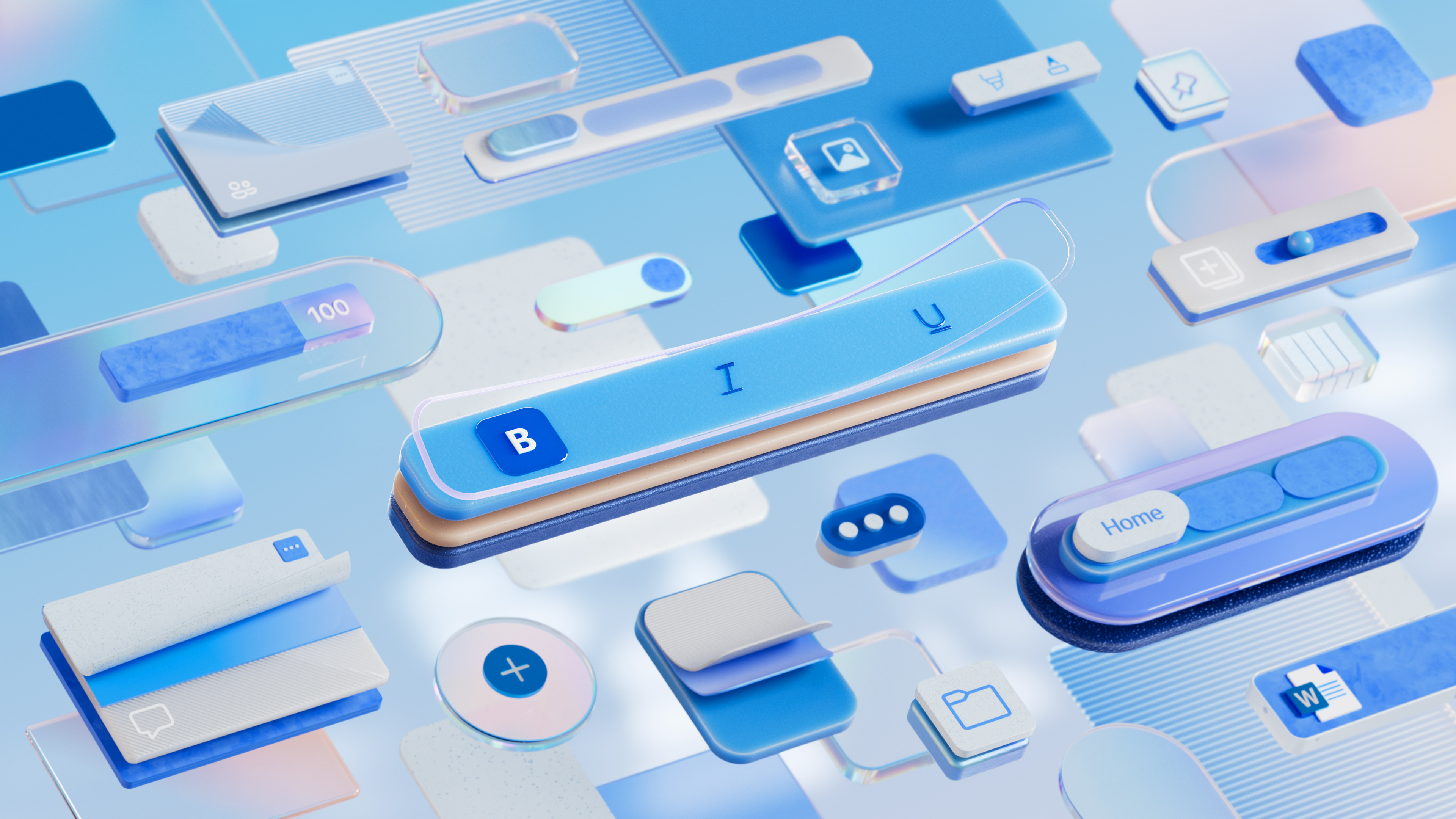
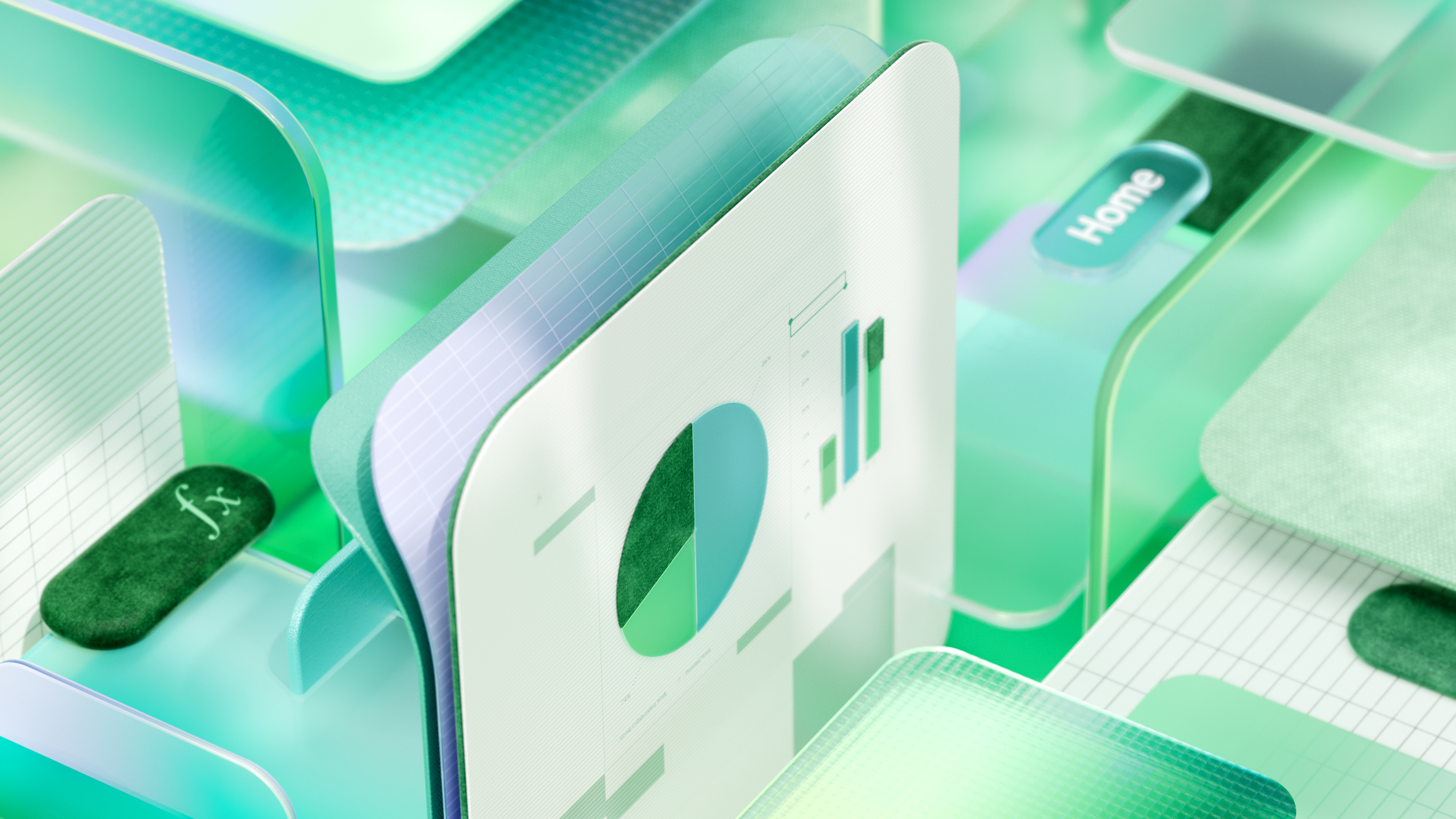
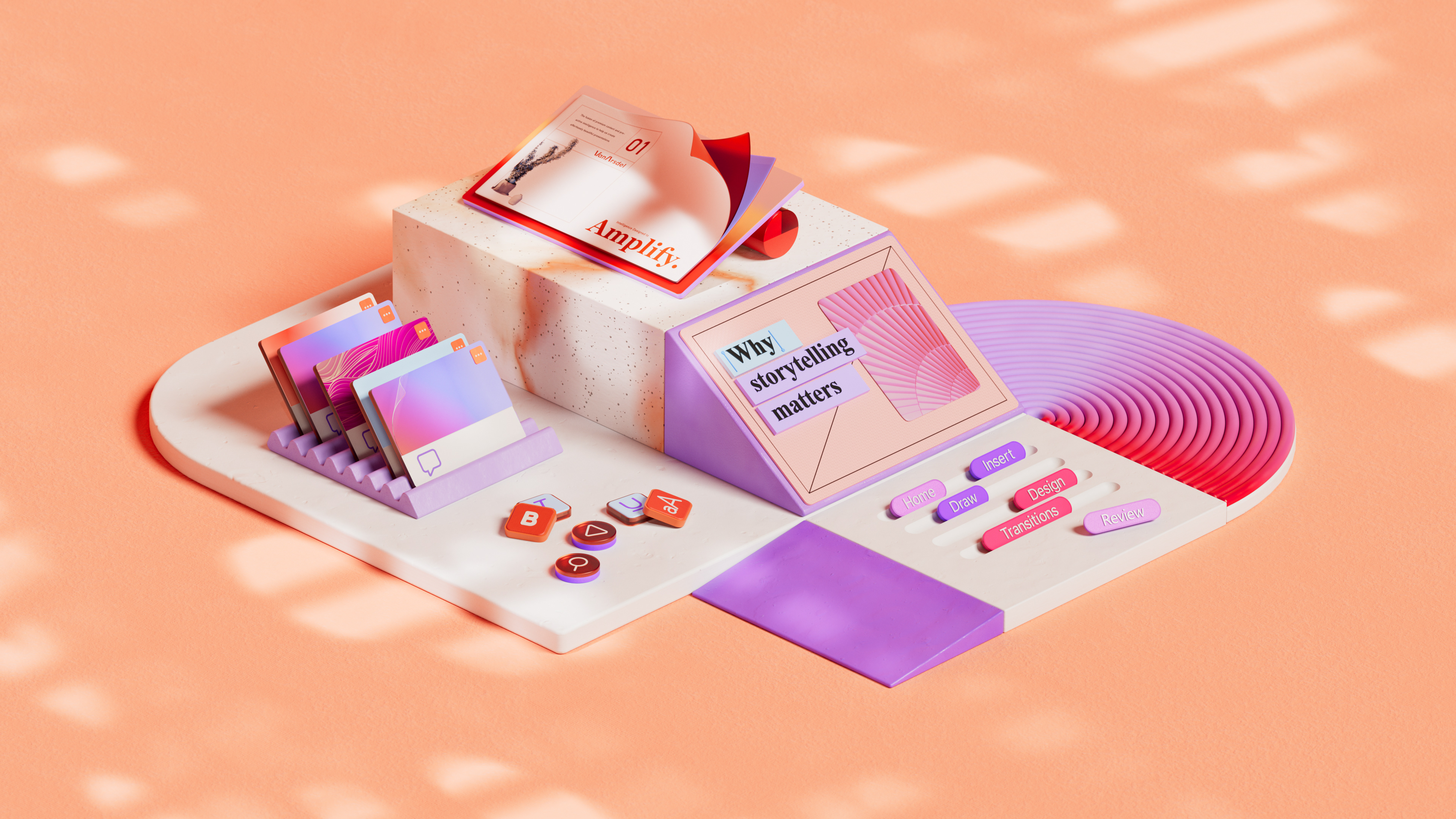

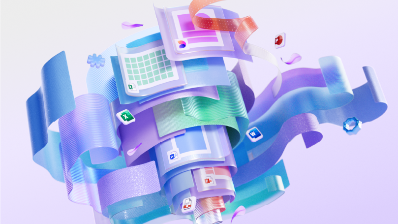
Additionally, we were tasked with creating images to be used within Word, PowerPoint, and Excel UI applications. For each app, we developed two types of visuals: one render focused on the application’s usage, depicting an image that could live in an actual document, and another CGI abstract interpretation of the app and its UI. Both images are applied to 2D designs, demonstrating the versatility and variety these visuals can offer.
Credits
A project by NotReal
Creative Direction: Valeria Moreiro, Milton Gonzalez
Executive Production: Roberto Connolly, Maximiliano D'Angelo, Larissa Miranda
Executive Production: Roberto Connolly, Maximiliano D'Angelo, Larissa Miranda
Creative Project Manager: Mercedes Ginzo
Project Manager: Florencia Vilardebó
Talent Recruiter: Lucila Mansur
Art Direction: Lu Borzi, Mercedes Ginzo
3D Design: Juan Cioffi, Vitor Teixeira, Florencia Tasso, Joan Garcia Pons, Friedrich Neumann, Josefina Llano, Carolina Carballo, Juan Coria, David Padilla, Rob Juarez
2D Design: Federico Sanchez, Florencia Porreca, Nicolas Martinetti
Client: Microsoft
Microsoft Team: Yulia Makhmudova, Alexis Copeland, Jana Huskey, Samuel R. Clarke, Kewi Bedoyan
Year: 2023, 2024
